SPOT : Visual scientific data analytics made easy
Analyze complex scientific data with only a few clicks and share it with other researchers FAIRly. Even Dark Matter data.
If you are using scientific visualization tools in your work then you should read this post. If you are developing a visualization code for your scientific data then you must definitely read this blog post (you can also jump straight to the demo).

More complex data, more to analyze
The amount of the scientific data we were dealing with few decades ago is not even comparable with the data someone uses today while listening to a single song on Spotify (do you remember IBM’s RAMAC with 5 mb of hard drive?).
Recent developments in the computer world (faster computers, High-performance computing and Cloud systems, GPU computing etc.), faster internet speeds, advanced (big)data processing tools, and the fast adoption of new hardware and sensors (IoT), resulted in having a huge amount of data. We have more information, and more stories to tell about data. However, the data itself does not have any meaning. Researchers need to analyze and summarize their findings in a way that it will be understood easily.
Imagine a biologist doing research on birds, a physicist searching for new particles, or an artificial intelligence expert working on a new solution to make our lives easier. They all end up with complex data which they need to explain in simple way. A good way to summarize these findings is data visualization.
Visualization is as important as collecting and analyzing the data. Because, visualization is what one uses to defend an idea or a thesis on particular subject. The presented graphics should be very easy to understand and clearly indicate what one wants to deliver as a message; simple and informative.
SPOT: interactive, responsive, fast, multi-dimensional scientific data visualization
Most of the scientific data visualization tools require some programming skills or you need to spend a significant amount of time to have a decent plot. Complex data, e.g. multi-dimensional data, requires more complex software to analyze.
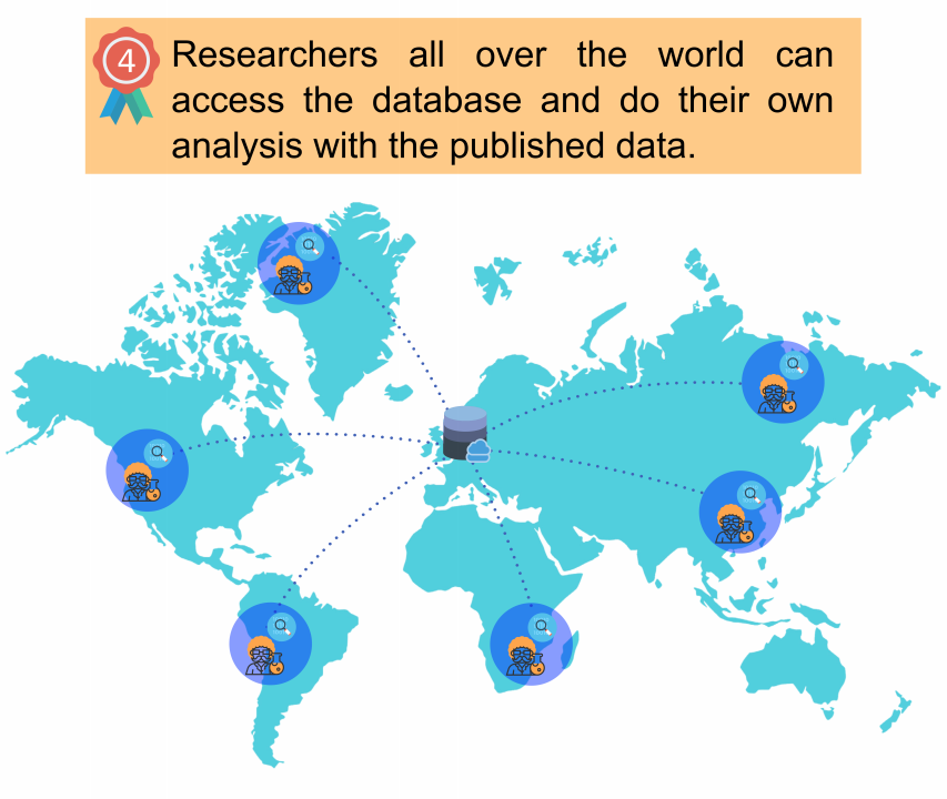
In one of our eScience projects, the iDARK project, we aim to combine the worldwide data within the most general models of Dark Matter. The Dark Matter models will be collected in a database which will be publicly available to researchers. We also make sure to follow FAIR data principles. The other objective of the project is to develop a visualization tool for Dark Matter models. As the Dark Matter models can have a very high number of variables (more than 100 variables), a visualization tool should be suitable for multi-dimensional data. The database of collected models and the visualization tool will be served at http://www.idarksurvey.com.
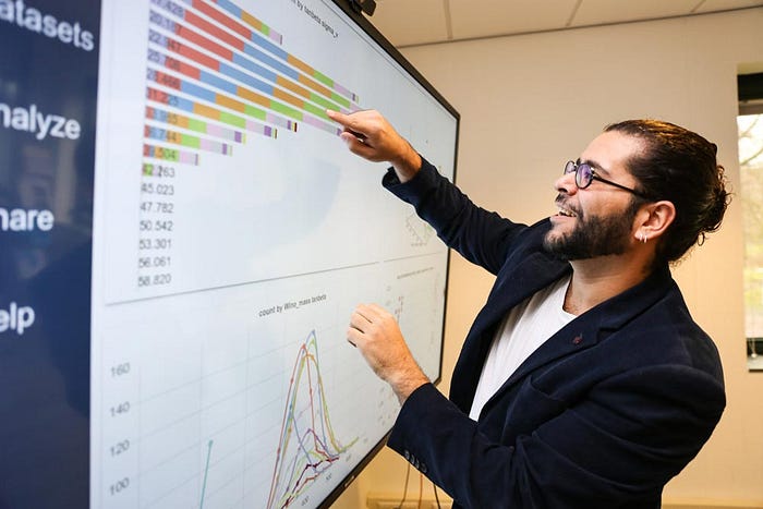
As a demand for the iDARK project and several other eScience projects, at the Netherlands eScience Center we developed a web-based visual data analytics tool to help researchers to interactively produce beautiful charts and to spot crucial information in your data: SPOT. We paid special attention during the development SPOT to make it available and useful for as many research areas as possible. As a result, SPOT can be used in other scientific disciplines as well. The workflow of SPOT is shown below.


OK, but why do I need SPOT?
A short answer: it is easy to use and you can very quickly discover your data without any programming.
A long answer: besides producing attractive charts, SPOT has advanced features which can help you to understand your data better. Especially, complex data, e.g. multi-dimensional data, needs more advanced tools for visualization. SPOT can handle this kind of data easily and allows you to explore your data by interacting with it. In other words, it can be used as a data exploration tool. Moreover, if you have more than one dataset, you can connect to a database server and generate your plots. Another bottleneck in data visualization is sharing the produced charts with others. When a plot is shared as an image, no modification can be made. SPOT solves this problem by sharing the dashboard you generate. The plotting session which includes plots, with individual properties, and the data used in plots can be downloaded. This session file can be shared with another user to regenerate the original plots with all the properties.
A closer look
A demo page of SPOT can be accessed at http://nlesc.github.io/spot. When you land to the main page, you will have a dialog to guide you through the interface. We also prepared a tutorial to get you started: https://nlesc.github.io/spot-tutorial/tutorial.
On the left hand side you have 3 simple steps which can provide you all the functionalities of SPOT:
- Datasets : allows you to upload data, connect to a database and configure existing data
- Analyze: this is where you create charts only with mouse clicks and drag & drop
- Share: you can download the charts(and the chart data), or share the complete session with others
The help button on the bottom left will interactively guide you in each of these pages.

In order to visualize your data, all you need to do is upload your data either in plain CSV file (file with ‘comma separated value’) or JSON (standard Javascript data format) file and a few mouse clicks. Voilà! You have your plots in a decent format already. After that, you can interact with your charts and explore your data.

A concise tour
In order to give you an impression about the user interface and simplicity of visualization process, I will briefly explain you the steps to create plots. You can also try SPOT yourself at the demo page.
Datasets page:
In Datasets page, you have three options to upload your data:
- connect existing database server
- upload a data file in json format
- upload a data file in plain csv file
The first option requires a configured database server. The second and the third options are used to upload a file in your computer: just select the file press OK. The file will be uploaded and the content will be scanned, automagically configured by SPOT. If you will be uploading a CSV file, you may need to set options using the gear icon.


Once you upload data or connect to a database, the existing data will appear in the list. You can enable or disable the data using the switch button. Advanced configuration of each data can be accessed using the gear button.
Once you have configured your data, you can navigate to the Analyze page.
Analyze page:
In order to create a chart, you can click on one of the 8 chart icons. The cart will be created in the dashboard and settings will be displayed immediately. Simply drag and drop variable(s) to the one of the highlighted boxes in the chart window. Press the gear icon to close settings and view the cart. It is so simple, isn’t it? You can create as many charts as you like. All the charts will be connected to each other (multi-coordinated view). When you apply a filter in one of the charts, the other charts will be updated accordingly. Depending on the chart type, options in the settings view may change. In my next blog post, I will explain how to create more complicated charts and how to interact with them. If you are impatient, please go ahead and try it yourself.

Share page:
When you complete your analysis, you can share your dashboard in this page. You can download the complete session or the data only. This session file can be used to restore the session using upload session option. Alternatively, you can upload the session to the cloud and share the link. The shared link can be used to load the session using the get session option.
Note: Cloud sharing uses the file.io service and the link will only be available for 14 days.

Free and Open source
Unlike most of the data analytics tools, all these features come at no cost. SPOT is a Free and Open Source Software, with a very permissive licence(Apache License 2.0).
We also have a desktop version of the SPOT which will allow you to use SPOT as a standalone desktop application.
Let us know what you think —is it easy to use for you? Do you miss any crucial features? Let us know in the comments below!

