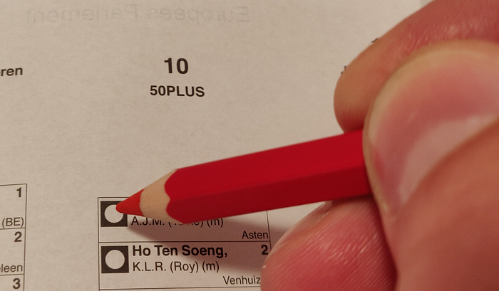
Democracy: Rule of the dimensionally reduced people
Dimensional reduction. Who doesn’t love it? Everybody does!

On that note: EU election week! Time to map our complex individual preferences to one of a few packages of lumped together stances.
Luckily, with the advent of political matching tool websites, this is as easy as answering a couple of questions on a one dimensional scale. The algorithm then takes care of the optimal mapping, you can cross the right box on the ballot and get on with your life, knowing you’ve been a good citizen and all will be well!
As much as I love one dimensional reduction, though, I have an odd preference for the two dimensional reduction that Kieskompas (Election Compass) has offered for years now in the Netherlands. Yesterday morning, I took the test.
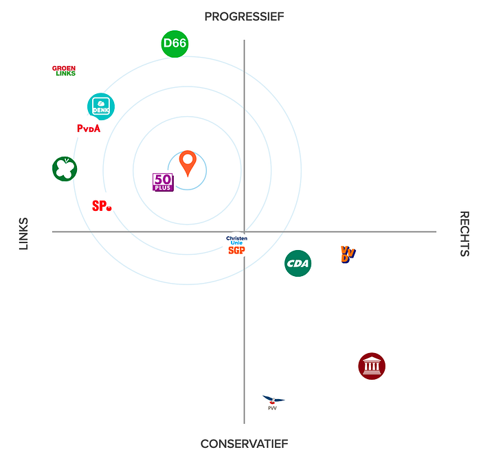
Arrgh, right in the middle of the black hole of despair!
I’m definitely not going to vote for 50 Plus, the (seemingly) one-issue pensionado party. All the other parties are miles away, so what good is this advice? How could it even be that 50 Plus is so close to me? Is there some kind of weird averaging going on? Are my (or 50 Plus’) answers canceling each other out in such a way that we just happen to end up in the exact same place, even though we’re diametrically opposed on every issue, which I must assume we are?
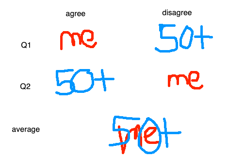
Spoiler alert: it turns out this party actually isn’t such a bad fit for me.

But I sure as hell wasn’t going to accept that without a fight. I was sure something was wrong with the algorithms. I was going to get to the bottom of this and find out a way to get me a better match. Get me my data sciencing tools!

Data gathering
The Kieskompas contains 30 questions that can be answered on a 5 point scale: “strongly agree” (2), “agree” (1), “neutral” (0), “disagree” (-1) and “strongly disagree” (-2). You can also skip questions. The answers are clustered into 7 topics, but I won’t use that here.
So there’s two basic pieces of data I need here: my answers and those from the parties.
My own answers
I already filled out all the questions on the website, so the data should be around somewhere in my browser cache. Using Firefox’s development console, I was able to find it in the storage section (Shift-F9) under Local Storage.

This JSON data can be easily copy-pasted into a Jupyter notebook, where I was going to Python-fu this thing into submission. Using an advanced JSON to Python conversion technique (first cell below) and some Pandas magic, we end up with a neat dataframe:

The important column is answer.value, which I can compare to the answers given by the political parties.
Party answers: enter ipysheet
That party answer data, however, was not as readily scrapeable. Possibly, there is some copyright involved there as well (which is also the reason I’m not sharing all this stuff publicly), which forced them to hide the data a bit. Possibly, I’m just not looking in the right places. Whatever the case, I couldn’t find it.
Luckily, the website offers a page to compare all your answers to all the parties’ answers, so we can just manually copy all 30 of them for all 12 available parties!
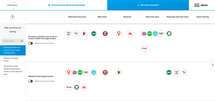
“Manually copy?!” I hear you object. Normally, I would agree with you, even if it’s just 360 numbers, manual labor goes against everything I stand for as a lazy programmer (or rather: sit for), but I was getting desparate for data and I had hit a wall. Also, this gave me a good excuse to try out ipysheet!
The ipysheet Jupyter widget gives you an editable spreadsheet table right in your Jupyter notebooks. We can generate the table we need to fill in all the answers like so:

That fills it up with zeros that we can then change to their proper values based on the answers on the Kieskompas website. After doing that, you can export them to a dataframe, which you can then easily save to your favorite file format:

Science that data!
Now for the fun part: comparing the numbers in such a way that makes the results more palatable.
T-SNE
My first thought was to try an alternative method of dimensional reduction. And what do we all think of first as true hipster data scientists? T-SNE!
If you’re interested in learning about this method, check out this article on T-SNE that looks pretty good. Since I was impatient, I didn’t read it at all, but just went straight for scikit-learn, copy pasted the first thing I found, and tried to reduce the differences between my answers and those of all the parties to two dimensions:


Being an optimist, I completely expected the T-SNE dimensions to be better than the Kieskompas dimensions (which must have been meticulously designed and perfected over the past decade or even longer).
Perhaps not surprisingly, I was disappointed. Naive application of T-SNE just gives random results. Each run gives a totally different result:
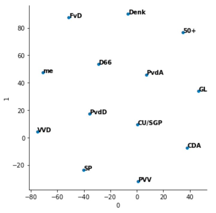


A bit of randomness is not a problem per se, but there doesn’t seem to be any structure to this, so that’s not going to work.
Simple distance
When complicated stuff fails out of the box, it’s time to go back to basics. This may allow us to get a better grip on the data.
Let’s start by just computing the Euclidian distance directly in the 30-dimensional answer difference space:

This is not completely what I would expect either, but I guess we can make some sense of it. I guess I’m usually a more or less center-left voter, so one could expect that my distance to the traditional center parties (VVD, CDA, PvdA) is small. Their answers are usually not at the extremes, so -1, 0 or 1. Parties like the PVV, FvD, PvdD and GL tend to take stronger stances (particularly on EU and climate matters, which 10 questions are about), so more 2s or -2s. Probably, using Euclidian distance directly on these numbers makes distances to these parties larger, unless you happen to have the exact same stances on most issues. It may help to somehow weigh the numbers to make differences slightly less extreme. But probably transforming the space in a more non-linear way is necessary… which was the original reason for trying T-SNE.
Principal Component Analysis
Ok, so let’s try another standard trick of the trade: doing a principal component analysis (PCA). Simply put, PCA transforms a space with points into a space with different axes, ordered by the amount of variance in the data they describe. In other words, if these data predominantly spread out over a clear “left vs right” axis, PCA will find it and transform the points into that space. It is then trivial to plot the points along that axis, or along multiple such dimensions. The second dimension will already explain less of the variation, but might still be significant. Etcetera.
Note that this is not at all guaranteed to give the same result as the two Kieskompas axes “left-right” and “conservative-progressive”. In fact, the Dutch parties seem more concentrated along the diagonal from left-progressive to right-conservative. This would mean that you would expect PCA to pick up this axis as a first dominant one.
Again, we can use scikit-learn, where we just replace the TSNE model used above by a PCA model. First, let’s look at just this first, dominant component (or axis):

When we sort all parties along that axis we get this:

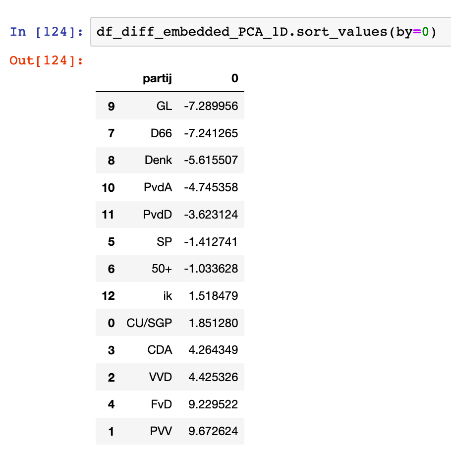
For comparison, a rotated version of the first image is shown alongside the sorted results. The only two parties that are not ordered exactly like in this diagonal Kieskompas axis are D66 (by a few pixels) and FvD (the bottom one).
So, clearly this PCA thing agrees in some way with the Kieskompas. Of course, that is exactly the opposite of what I wanted to achieve. I’m still next to 50+. Damn you, data science!
Intermezzo: if you get annoyed at my overuse of the term data science, I’m with ya, I just noticed it myself. Let’s switch to machine learning from now on. Then I’ll try statistics if that starts annoying me as well. Maybe I’ll even throw in a big data analytics if push comes to shove.
Let’s add one more PCA axis, see if that brings us any respite:

Interestingly, this (vertical) component moves a lot of parties far away from me. I’m really unhappy with the ones I’m clustered left with though. These are typically the parties that are pretty much at the bottom of my “would ever vote for” list. In fact, I most often vote PvdD or SP, the parties that are now furthest from me! What’s going on here? Is this some kind of cyclical component?

However, it does again seem to map pretty well to the second diagonal of the Kieskompas dimensions. The match is a bit sloppier, but you can definitely see the general trend being right. The biggest exception is me! Other than that, the above 2D PCA decomposition matches pretty well to a mirrored and again rotated Kieskompas picture.
Pretty neat! I guess I should stop blaming Kieskompas and start looking in the mirror… ouch.
Conclusions
Ok, so after all was said and done, I completely failed on my original, important goal: to prove that I was not at all a match to the 50 Plus party. In a moment of clarity, I decided to actually compare the 50 Plus answers to mine… and it turned out they were indeed very close.
So thanks, Kieskompas for confronting me with this painful truth. Acceptance is the first step. I may write 50 Plus a strongly worded letter someday soon, demanding they change their name to accomodate my sensitivities.
Some other things that I learned or was reminded of:
- Finding the right data science tool or model for the job can be quite challenging.
- But so much is so widely available nowadays that really complicated problems can sometimes feel mind blowingly easy. I did all of the above in a couple of hours. The amount and quality of tools, especially in the Python and Jupyter world, has exploded in recent years.
- Right now, the only two major obstacles that are left in data science are one’s own imagination (and maybe experience) and the complexities that are inherent in the studied subjects themselves. You can no longer blame the tools!
- Political matching is hard and Kieskompas is doing a pretty great job.
- CSV for ever! (I tried saving to JSON, but then the indices would be loaded back as strings instead of integers. Boo!)
Note that I’m a complete novice in this field of political party space mapping (is that the correct term?). Please shout at me in the comments below or on Reddit or Twitter if I made some stupid mistakes. I’d love to talk to experts about how to do this better!
