Amsterdam as seen by a weather model
Visualizing local climate zones in 3D with the Cityblocks package
What sets a weather model apart from a video game? While video games prioritize stunning visuals over strict realism, weather models focus entirely on physics. Visualizations come as an afterthought at best. A missed opportunity, since good visualizations can reveal fascinating insights into how these models interpret the world. In this blogpost we bring Amsterdam to life in 3D through the eyes of a weather model — and invite you to try it for your city as well.
Weather models have a peculiar view of a city. To them, the world is made of boxes. Many roughly rectangular boxes. A typical grid box contains more than one building, so weather models see cities at a block level.

To describe cities at block level, one option is to use local climate zones (LCZs): a set of typical building blocks modeled after cities across the globe. Each LCZ is associated with certain properties, such as the typical building height, street width, or green fraction. With that, weather models have all the info they need to simulate the interaction between the city and the atmosphere, in a simplified form.

Typically, maps of local climate zones are displayed in 2D — a flat map. In principle, this is good enough, as we have only one LCZ per grid cell. But it doesn’t really appeal to the imagination. From the map above, I cannot tell how realistic this representation of Amsterdam actually is.
That’s why I started playing around with 3D visualizations instead. The idea is to reproduce the tiles from the illustration above as building blocks, and then place them on a plane in accordance with the pixels on the 2D map. Below, we detail two approaches, one with CityJSON, and one with QGIS.
Building a city in CityJSON
CityJSON file format is intended as a lightweight and developer-friendly format for spatial information. Like JSON, it is basically a set of key-value pairs. The CityJSON format specifies which keys are allowed/required and what values they can have. I was not familiar with the format, so this part of the blogpost also represents my learning experience. A simple CityJSON file could look like this:
{
  "type": "CityJSON",
  "version": "2.0",
  "metadata": {
    "geographicalExtent": [0,0,0,1,1,1]
  },
  "transform": {
    "scale": [0.001,0.001,0.001],
    "translate": [0,0,0]
  },
  "extensions": {},
  "vertices": [
    [0,0,1000],
    [1000,0,1000],
    [1000,1000,1000],
    [0,1000,1000],
    [0,0,0],
    [1000,0,0],
    [1000,1000,0],
    [0,1000,0]
  ],
  "CityObjects": {
    "id-1": {
      "geometry": [
        {
          "boundaries": [
            [
              [[0,1,2,3]],
              [[4,5,1,0]],
              [[5,6,2,1]],
              [[6,7,3,2]],
              [[7,4,0,3]],
              [[7,6,5,4]]
            ]
          ],
          "lod": "1",
          "type": "Solid"
        }
      ],
      "attributes": {
        "function": "something"
      },
      "type": "GenericCityObject"
    }
  }
}
The vertices represent points in 3D space. This file specifies 8 points. Each CityObject specifies an array of boundaries, which are essentially surfaces obtained by connecting the vertices. Here we have 6 surfaces, and if you draw them all up, you will see that this is simply a model for a cube.
The CityJSON home page is very welcoming. It contains lots of useful information and examples. There is an official online CityJSON validator, as well as a viewer called Ninja. So once you’ve obtained a CityJSON file, you can easily validate it and display it in the browser.
I started with the example of 2 cubes, and wrote some Python code to reproduce them as templates, such that I could place blocks randomly everywhere, and scale them in width and height. I created multiple combinations of blocks to reproduce the LCZ archetypes.
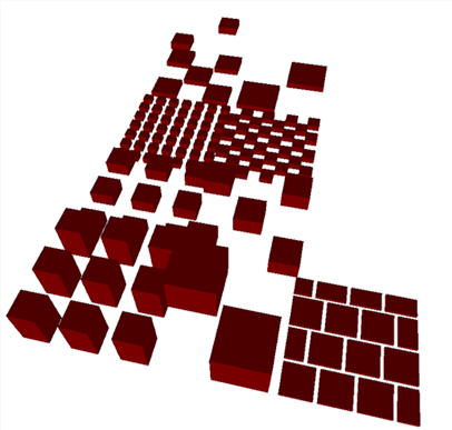
Next, I played a little bit with some random data to see how big of a city I could render. I found that 100 by 100 tiles still worked okay in the Ninja viewer. Effectively, this corresponds to a city of 10 by 10 km. I downloaded the global LCZ map from Demuzere et al. and cut out the Amsterdam area. The last step was to loop over all pixels in the image, and add the corresponding tile to the CityJSON file.
The code ran quite slowly, but it worked. The Ninja viewer went into “performance mode”, but eventually was able to display the data just fine. I was ready to observe the highly anticipating result…
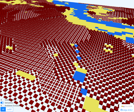
Admittedly, that looks a bit less spectacular than I had hoped for. The interactive view is a bit better, but still. While you can recognize the river, a canal, some parks and different types of buildings, this doesn’t really appeal to the imagination as I had hoped.
One way to improve upon this initial view would be to render the different LCZ classes with different colors, and make the tiles prettier with things like trees, just like on the example tiles above. However, it seemed the online CityJSON viewer doesn’t support rendering materials, and I was already pushing its limits.
In order to proceed with CityJSON, we would need to speed things up, and use a better viewer. There are several ways to speed things up. For example, by using CityJSON Sequences and maybe converting to 3D Tiles. Concerning the viewer, I tried using the Blender and QGIS plugins, but I struggled to use them properly. In the long run, I would like to publish something like this on an interactive webpage, so I would prefer to look at other solutions. The standard viewer uses three.js under the hood. It seems quite doable to embed such a viewer in a static website hosted from GitHub pages, for example. As such, anyone could clone the template and host their own city model with ease.
Making it beautiful with QGIS
At this point I was showing my progress to my colleague Maurice. He is one of our GIS experts and helped me to reproduce the workflow in QGIS. This alleviated some of the issues we had with the CityJSON viewer. With QGIS, we could render tiles in different colors, and use true coordinates to combine the tiles with other map layers. For example, here is a version where the colours of the tiles correspond to those on the 2D map above.
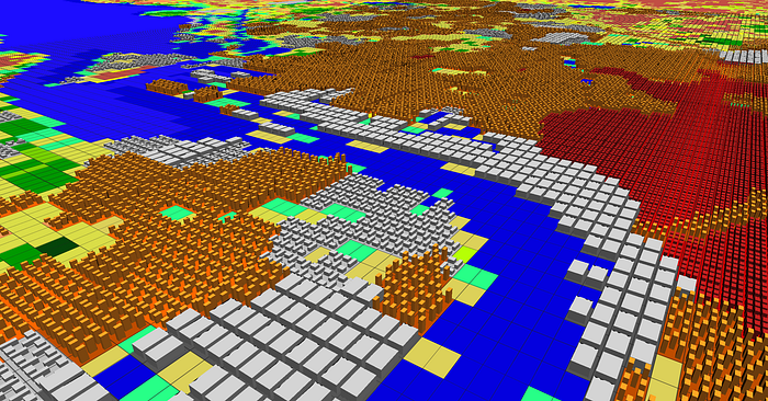
With QGIS, we took a slightly different approach. Instead of storing 3D cityblocks, we made 2D imprints of the LCZ types, and extruded them to a set height during the 3D render. We used Python with rasterio and geopandas to read and crop the original data and generate the 2D tiles. Intermediate data was stored as a GeoPackage, which can easily be loaded in QGIS.
Introducing Cityblocks: a simple tool to visualize your own city
We decided to spend a bit more time to make this workflow available for anyone. We polished the code and converted it into a small and easy to use Python utility called Cityblocks. You can use it to download the global dataset, extract an area of interest, and convert the data into tiles. Subsequently, the data can be visualized in QGIS, or something else in case you prefer. You can find the code and instructions here. At the moment, this is mostly tested for our Amsterdam use case, so we are very curious to get feedback on your experience with it for other cities.
Making it beautiful
At this point, we though it’d be nice to turn this little side quest into a real map that would stand its ground in an atlas of eScience Center projects.
A good map tells a story that jumps at the viewer without much context. We considered many different options, and settled on a design that places the tiles on a background map of Amsterdam, with a subtle raster to hint at the gridded nature of weather models. Here is the final result:

Seeing the map with and without LCZs makes it easy to compare the “human” view to the “weather model view”. Notice that most of the riverbank area, including the station, is classified as “heavy industry”, whereas the city center is dominated by “compact to open midrise”, for example. Apart from evaluating the classification itself, this view also reveals the relatively coarse structure the weather model sees, and how rigid the city looks. Perhaps it is a sobering view that reminds us that even sophisticated weather models are only an approximation of reality.
But it is inspiring at the same time! How can we improve upon this? One of the obvious wins is to use local properties like building height, rather than using fixed values from the LCZ classification. We started doing that several years ago in a project called Summer in the City. In that project, we identified properties like building height and “urban fraction” for the Netherlands. Now, in the Urban-M4 project, we are adding information on the radiative properties of buildings, by using open street view imagery. At the same time, our project partners at Wageningen University are collecting information on building age and other properties to add better-localized information on things like insulation status.
Next steps
I also have some ideas regarding the workflow and visualization. If time permits, here are some things I’d like to improve:
- Generalize tile creation: currently the position and dimensions of the buildings are hardcoded based on a tile size of 100x100m. It would be nice to generate them on the fly instead, so we could accomadate various resolutions.
- Randomize the tiles: related to the above, I’ve been thinking a bit on how to add some natural variation to the positioning of buildings. For example by randomly shifting tiles across periodic boundaries.
- Beyond LCZs: a generic tile creation routine could generate tiles based on some key properties like road width, building width, green fraction, et cetera. That would make it possible to vary these parameters independently, rather than coupled through LCZs.
- Combining the workflows for QGIS and CityJSON. Currently they have diverged a bit, but they share many steps. With a bit of work we could streamline and generalize the workflow and add support for other output formats as well.
- Procedural generation: automatically create artificial worlds and gamify urban weather and climate simulation 🙂
Concluding remarks
When it comes to visualization in weather and climate modelling, we often focus on output data. Here, we introduce an original visualization of the methodology instead. This provides valuable insights into the power and limitations of the LCZ approach. It appeals to the imagination can make our work more captivating.
What are your thoughs about using visualizations like this? Do you have other ideas, or want to share your own maps made with the Cityblocks package? We have created a GitHub issue to collect images of cities across the globe. It would be awesome if you would contribute your city as well!
Thanks to Claire Donnely and Ole Mussmann for providing comments on an earlier version, and to Tim Tensen and Maurice de Kleijn for creating the beautiful QGIS map. A chatbot was used to improve the formulation of a few sentences.

